In a post-truth world it’s hard to find the facts.
But they’re out there.
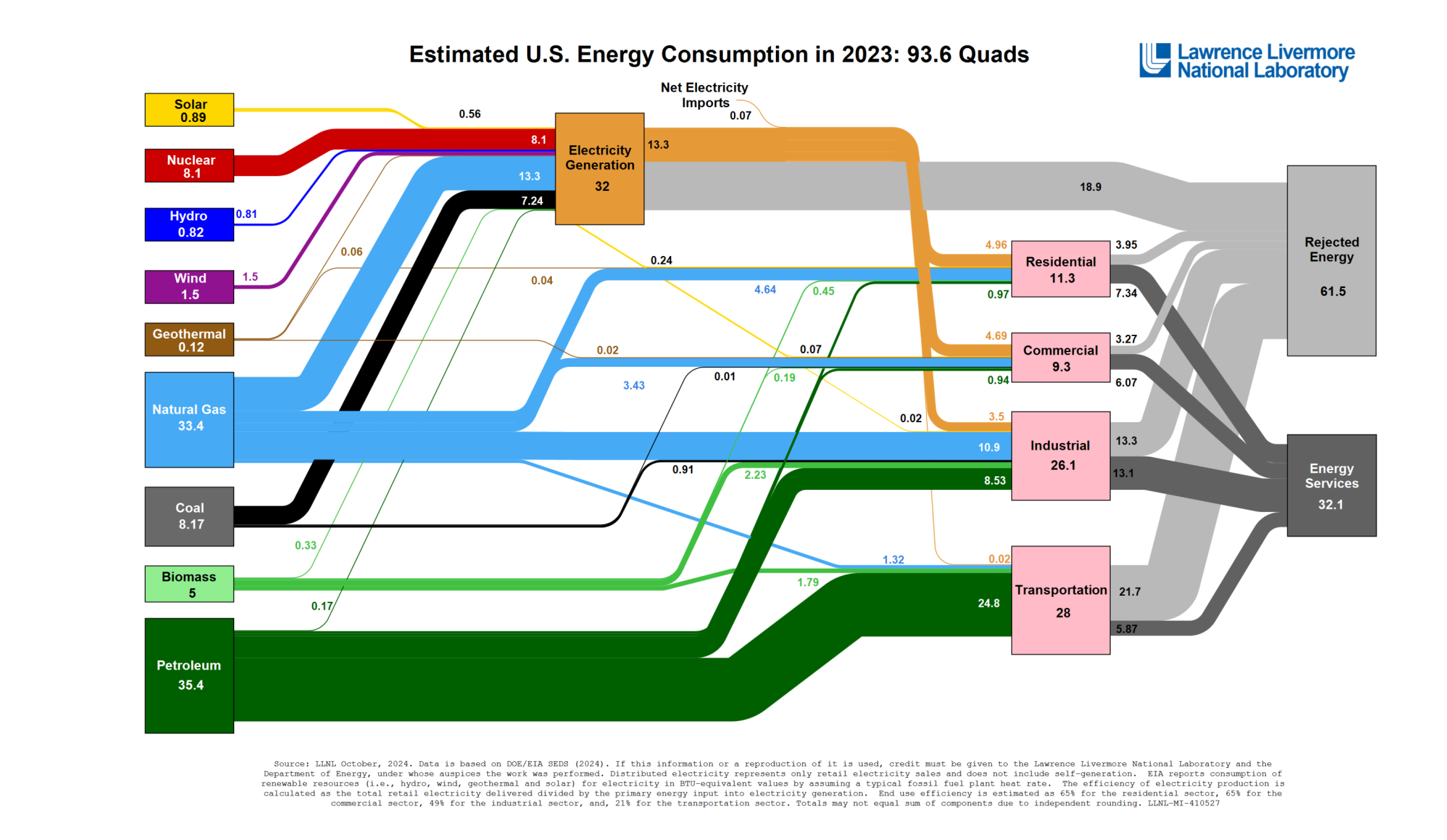
Here’s a chart with a great heapin’ pile o’facts. This particular style of flowchart is called a Sankey diagram. It is put out by Lawrence Livermore National Laboratory.
This chart tells the story of America and of being an American. The USA consumes close to 100 quads of energy each year. A “quad” is one quadrillion BTUs. A quadrillion is 15 zeroes, so one hundred of them is 17 zeroes. That’s 1 x 10^17 (or 1 E 17) or perhaps you prefer 100,000,000,000,000,000. Man, that’s a boatload! A BTU (British Thermal Unit) is a standard for measuring heat energy—you’ve probably seen a rating on your home furnace. It’s the energy needed to raise one pound of water one degree Fahrenheit. (A pint weighs about a pound.)
It’s hard to make these measurements, calculations, and estimates. But it’s good work. It tells you everything you need to know. I particularly like the gray flows labeled “Rejected Energy” which is a fancy way to say “waste heat.” Your car is mostly waste heat. Only a portion of the energy in gasoline (or diesel) goes into making the car move. The rest is waste heat.
Think about how much energy we waste! Natural resources ought be conserved, that is, used wisely. We can do better than this. (If you click on the chart it gets bigger.)